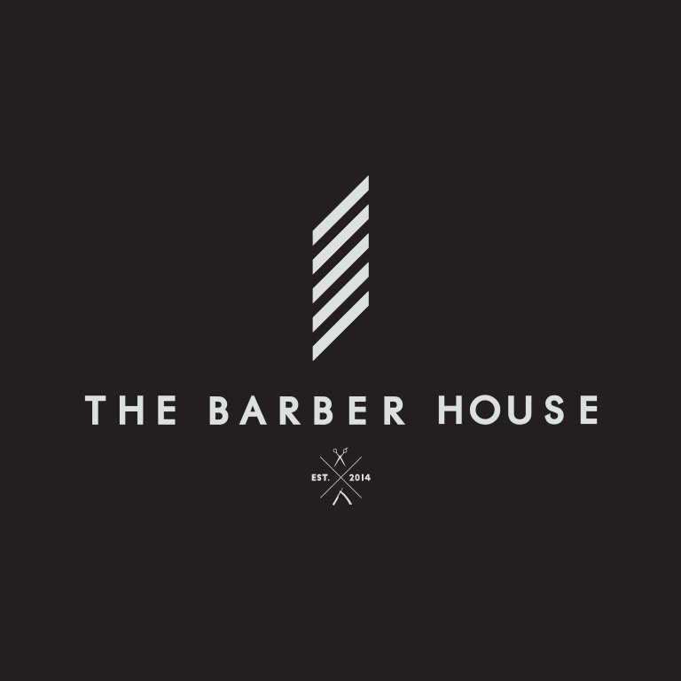
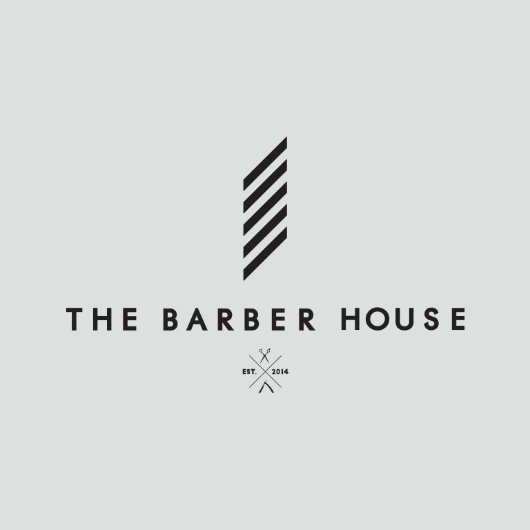
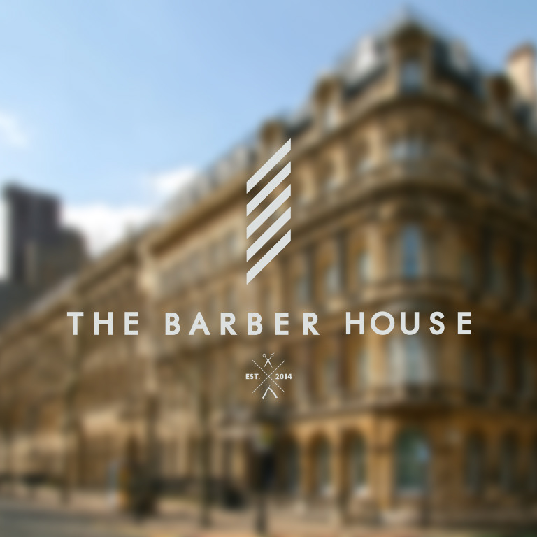
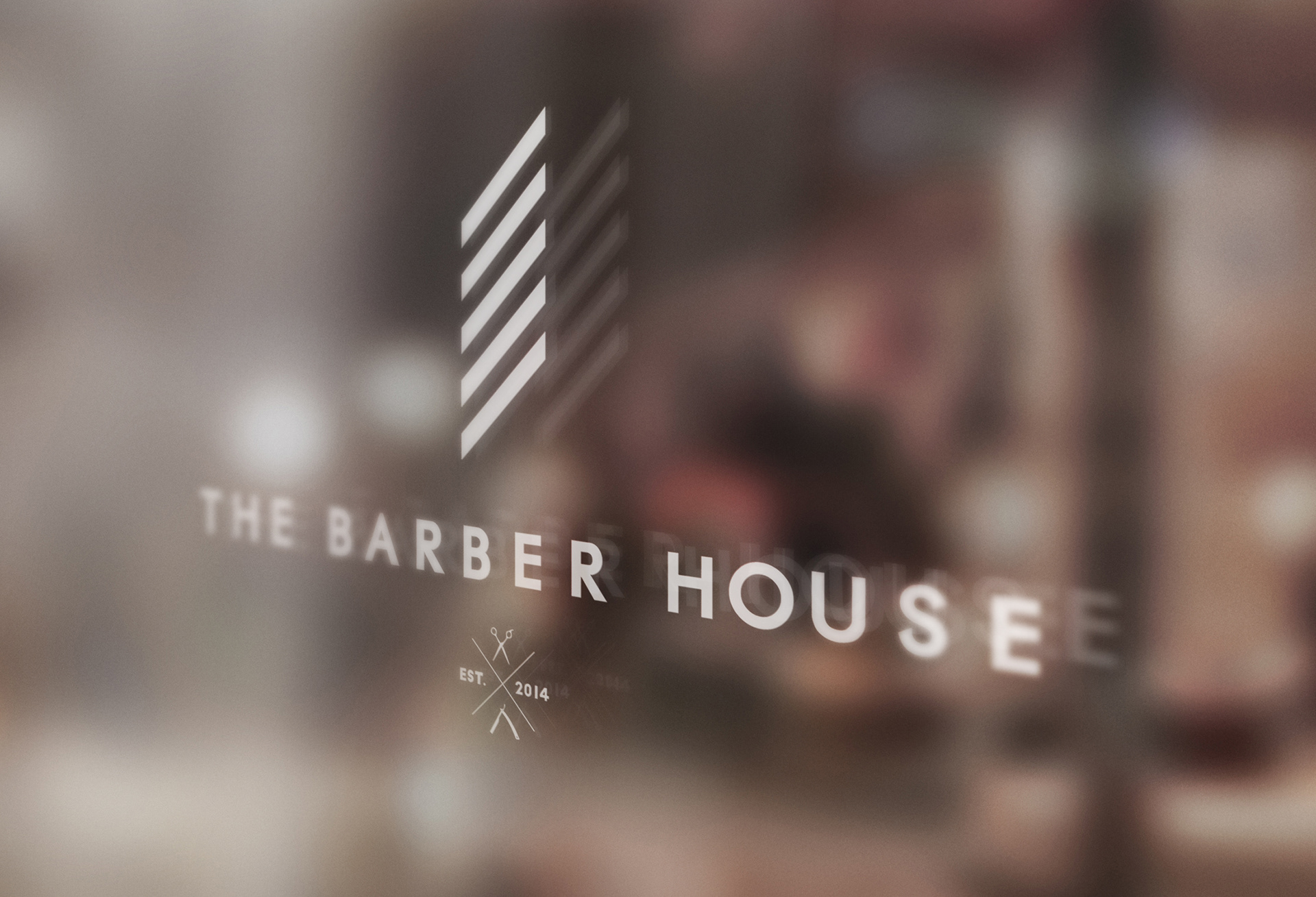
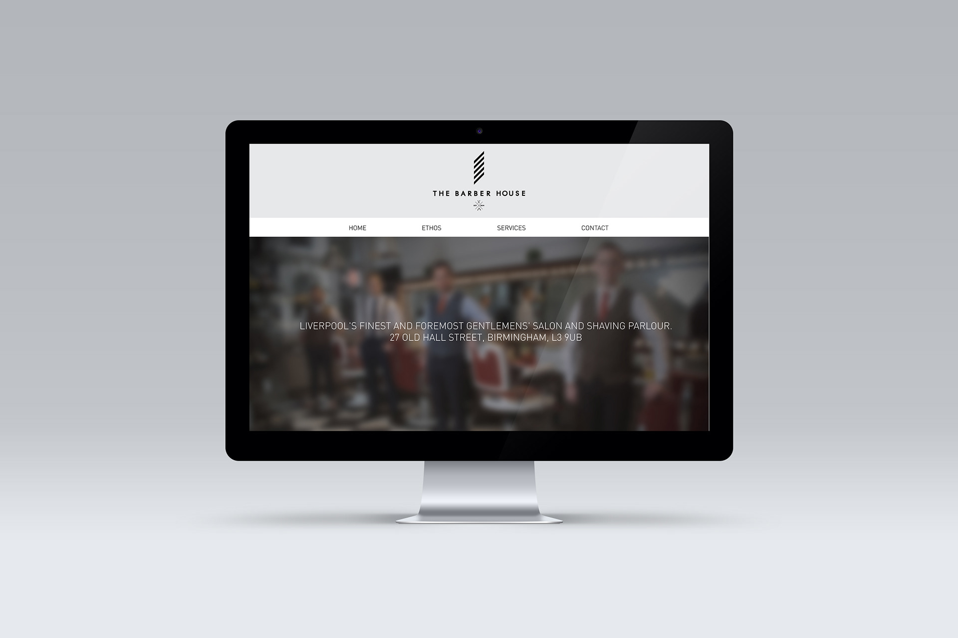
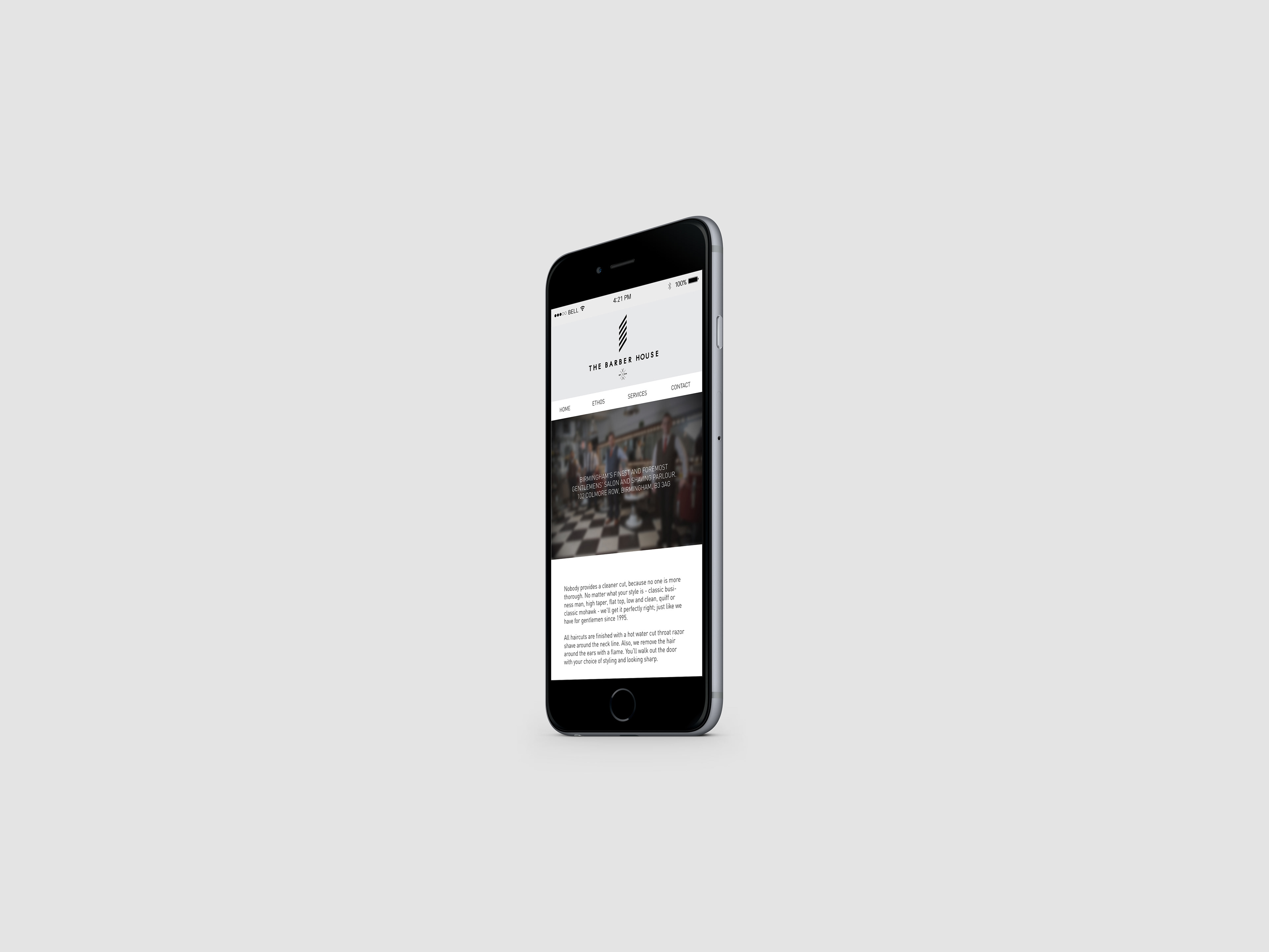
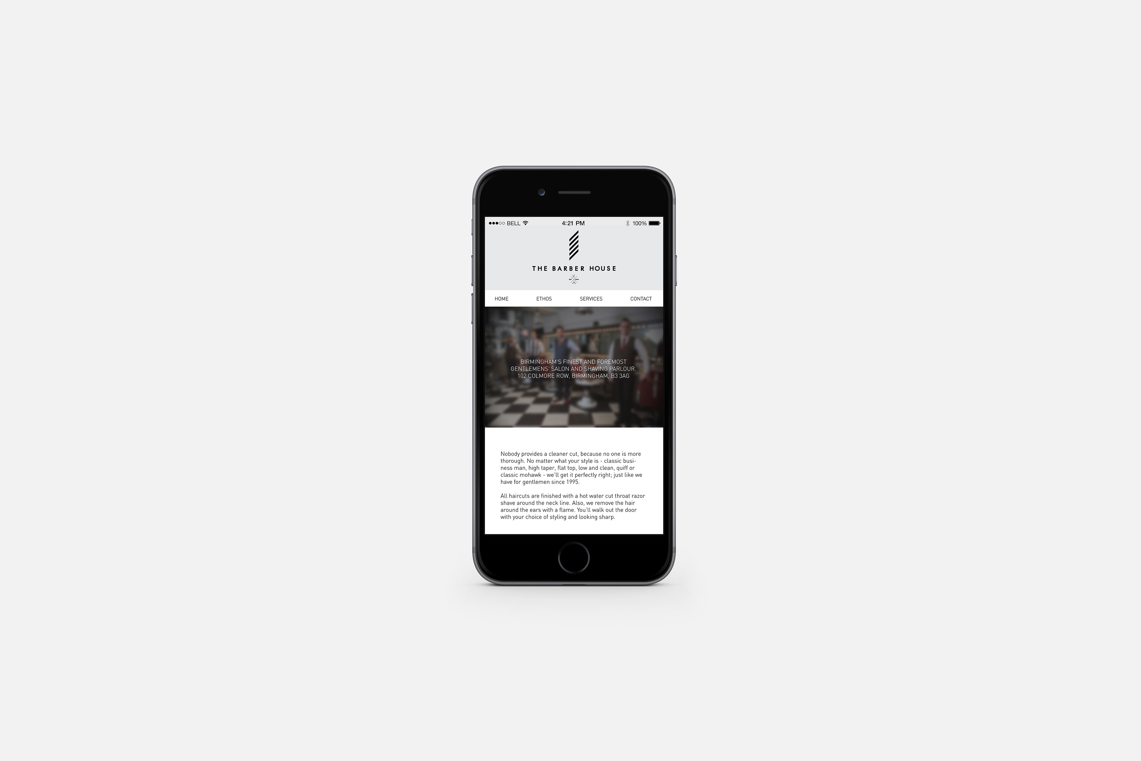
Re-imagined identity design for an existing Barber's. The existing logo was tired and too simple; formed of two letters within a simple circle, the Barber's required a logo more fitting and therefore one was carefully crafted. The logo itself was created to appear as a Barber's Pole but with the top and bottom parts left off to subtly hint at the sharpness of a Barber's blade. This logo was then complemented by the wordmark, created using a simple sans serif bold font. To finish off the logo, below is a set of symbols arranged around an "X" showing the year the Barber's was formed and two symbols representing the business.