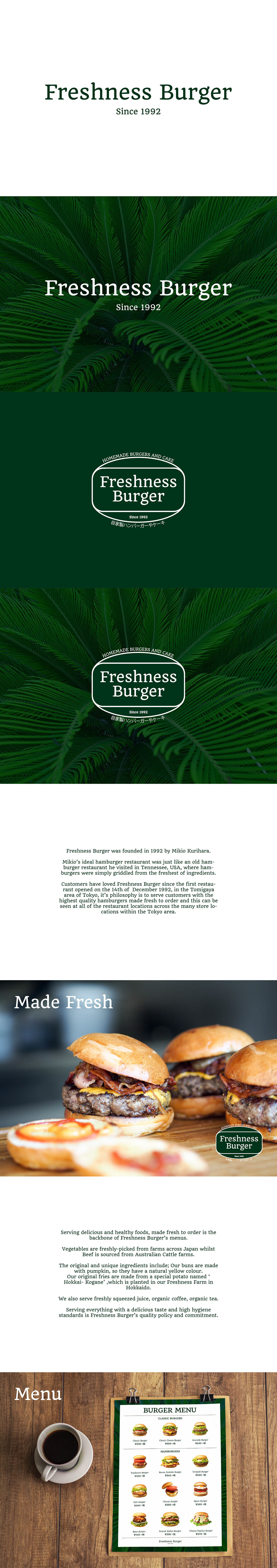
A personal project exploring the simplification of the Freshness Burger identity. The existing wordmark and logo is overcomplicated and messy, which doesn’t marry up to Freshness Burger’s mantra of creating healthy fresh food to it’s customers. Therefore a new wordmark was designed in a similar typeface to the existing, along with a new mark for the wordmark to sit that can be utilised for various signage and printed matter. In addition to this various options were explored in how to use this new wordmark and logo system. For instance one could use it on a solid colour as shown or over a photo that has been darkened with a coloured overlay. A menu also has been mocked up to illustrate the simplicity of the new identity in order to assist customers in ordering their favourite burgers.