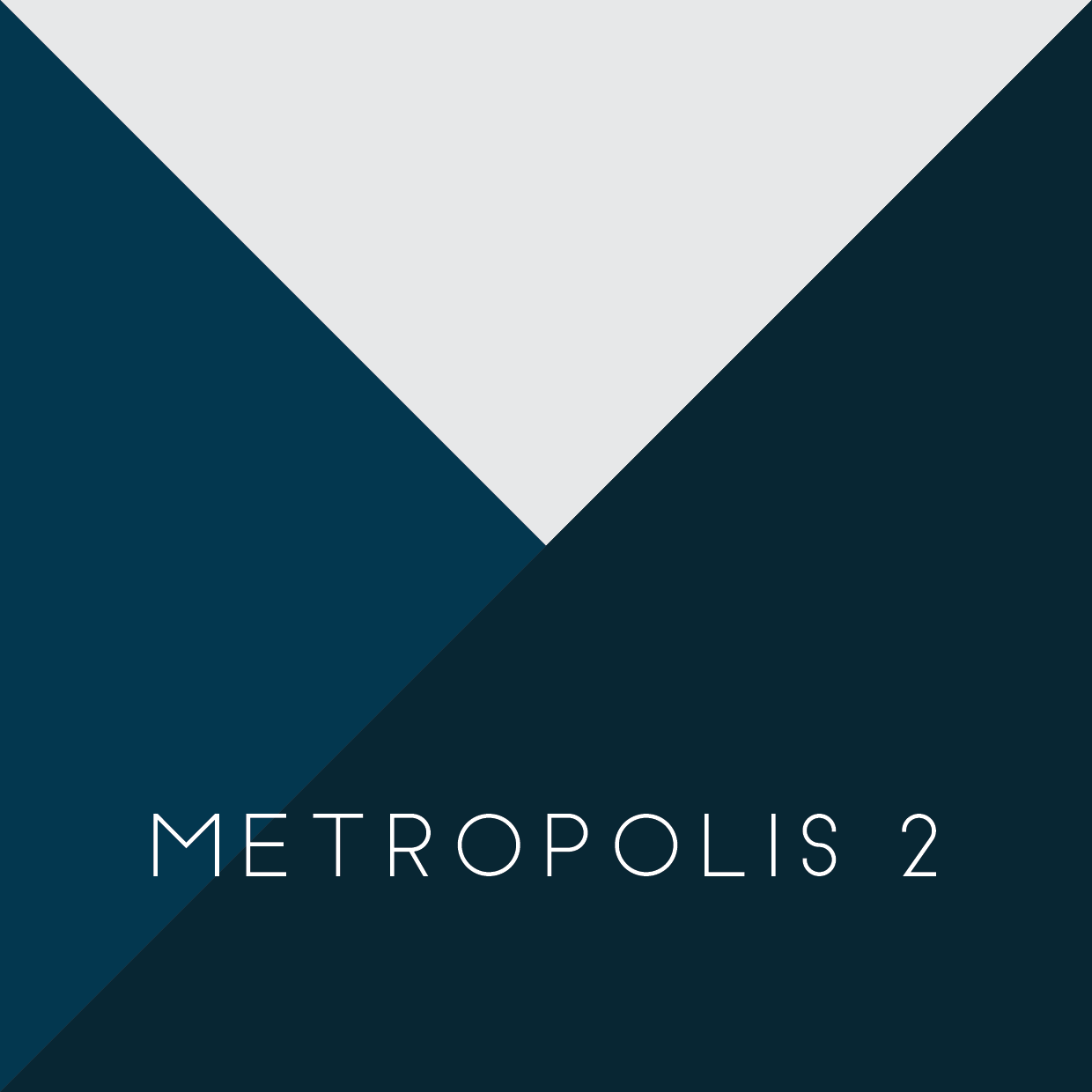
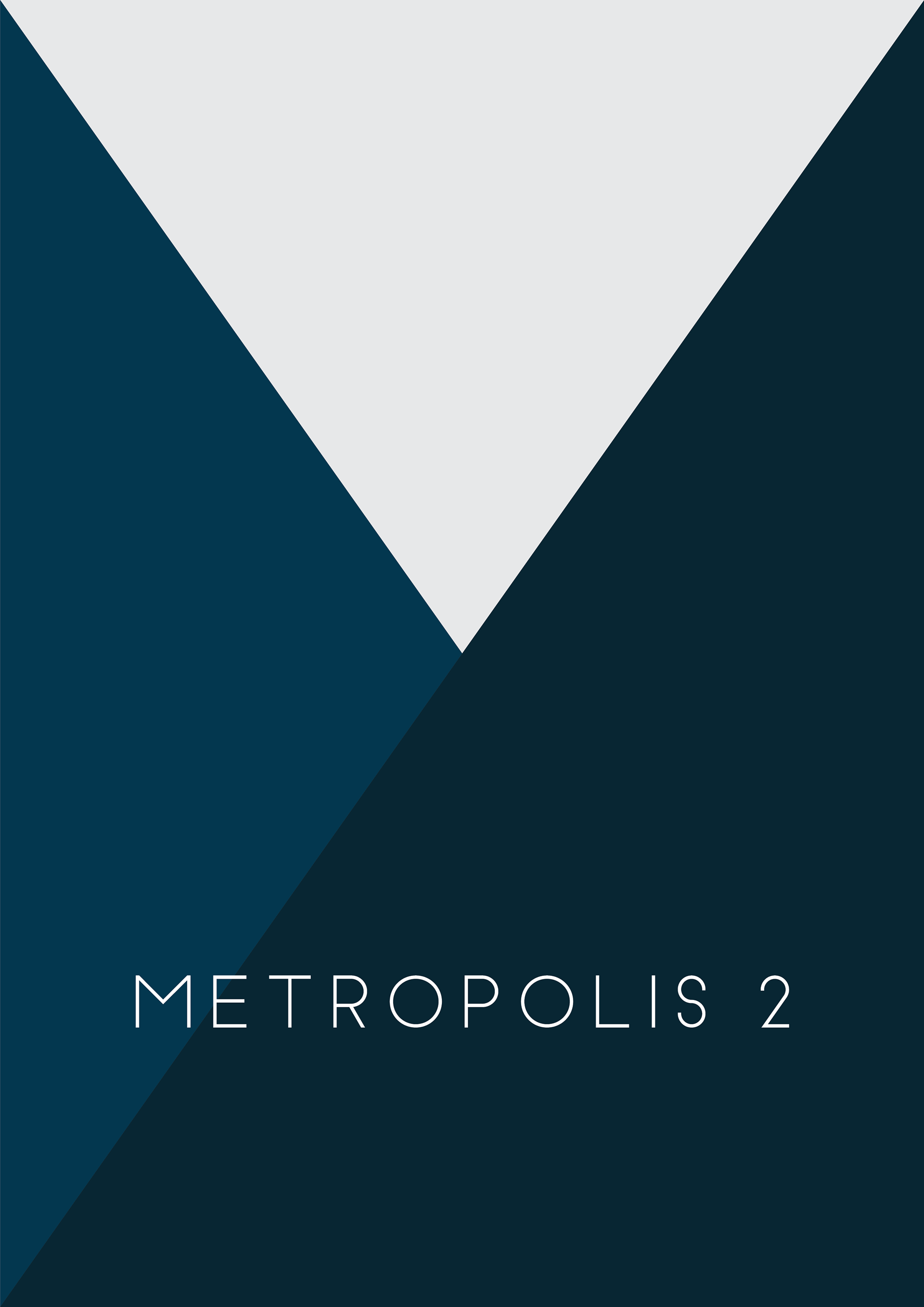
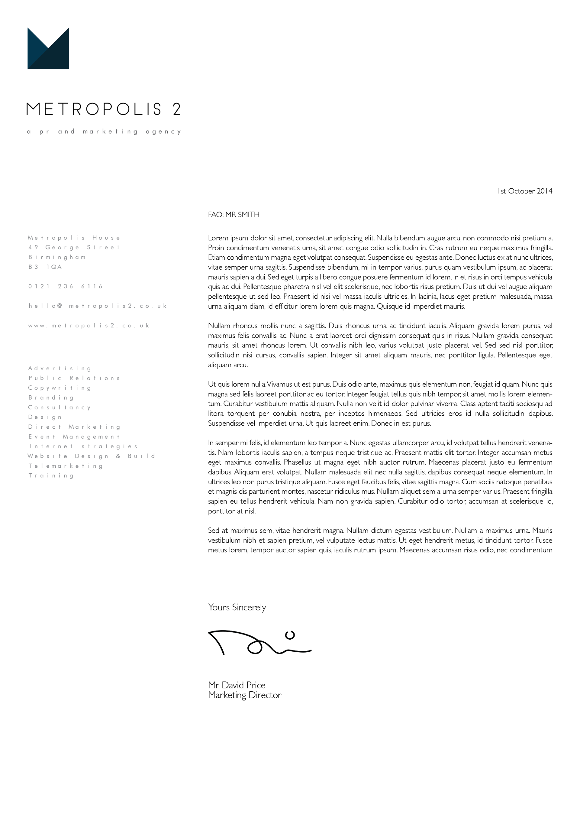
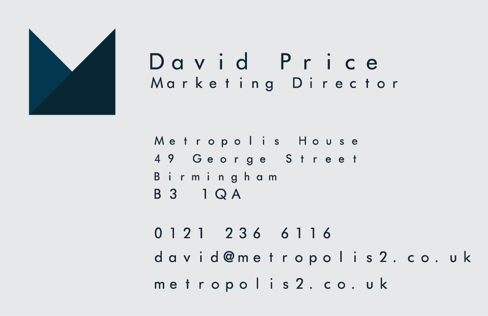
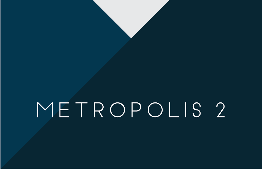
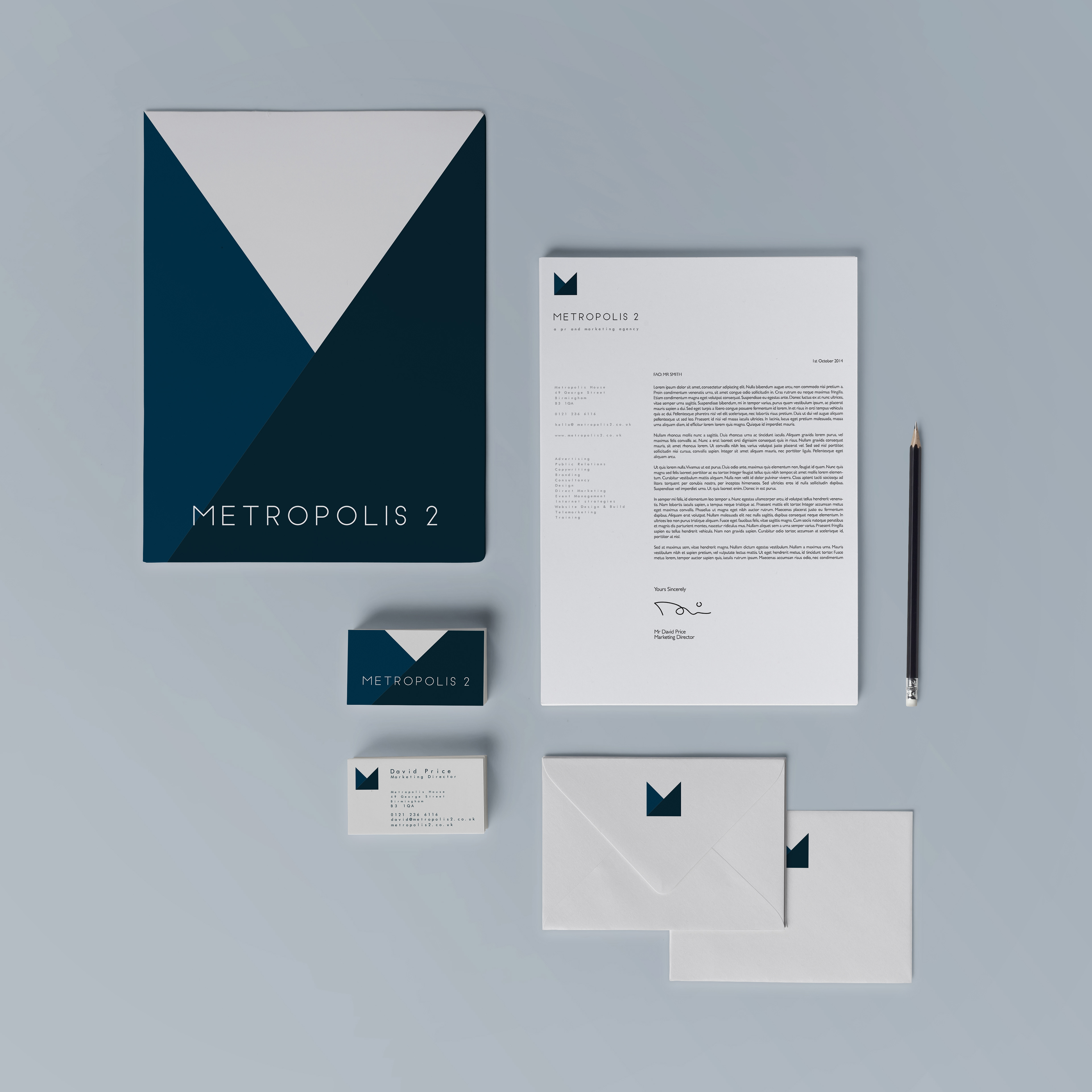
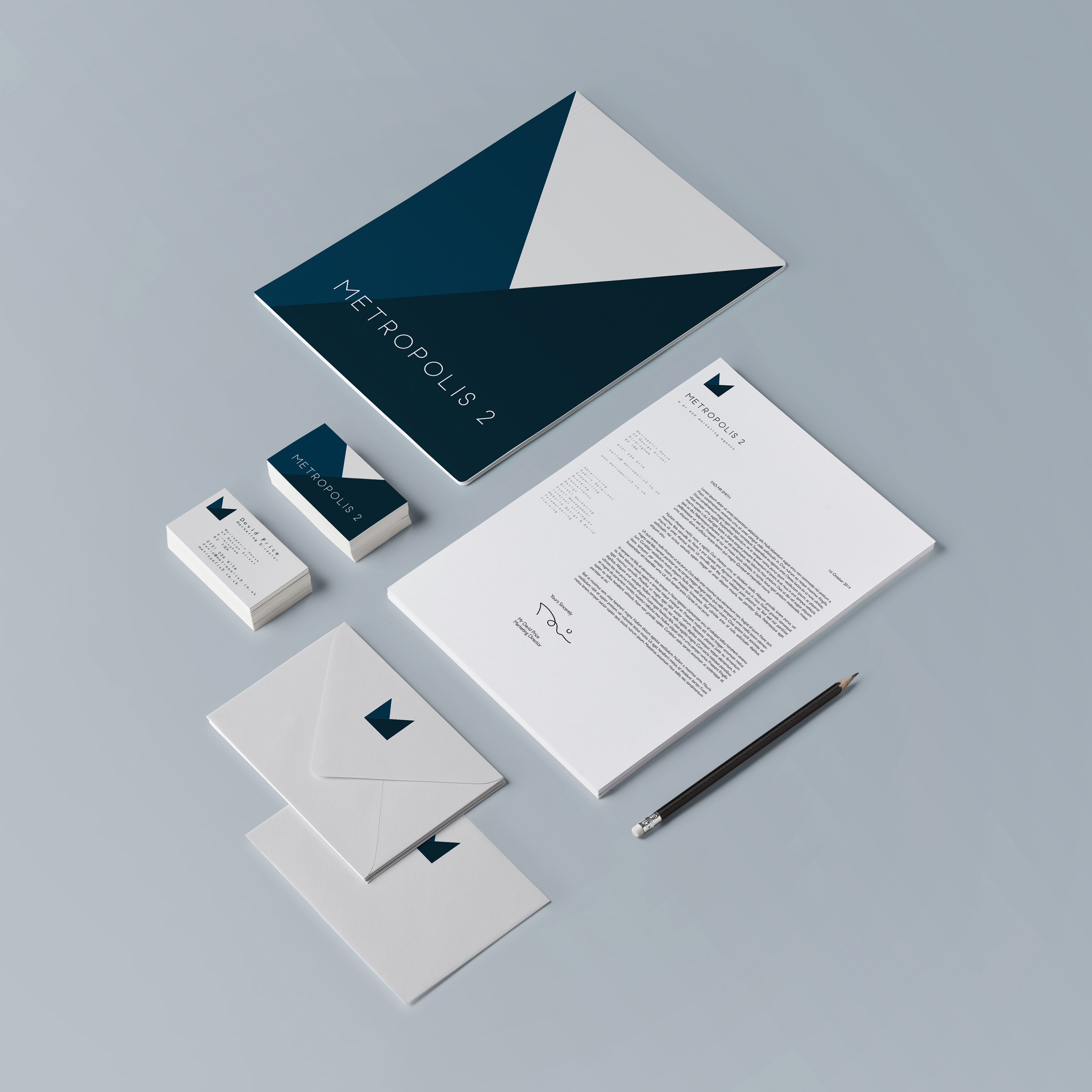
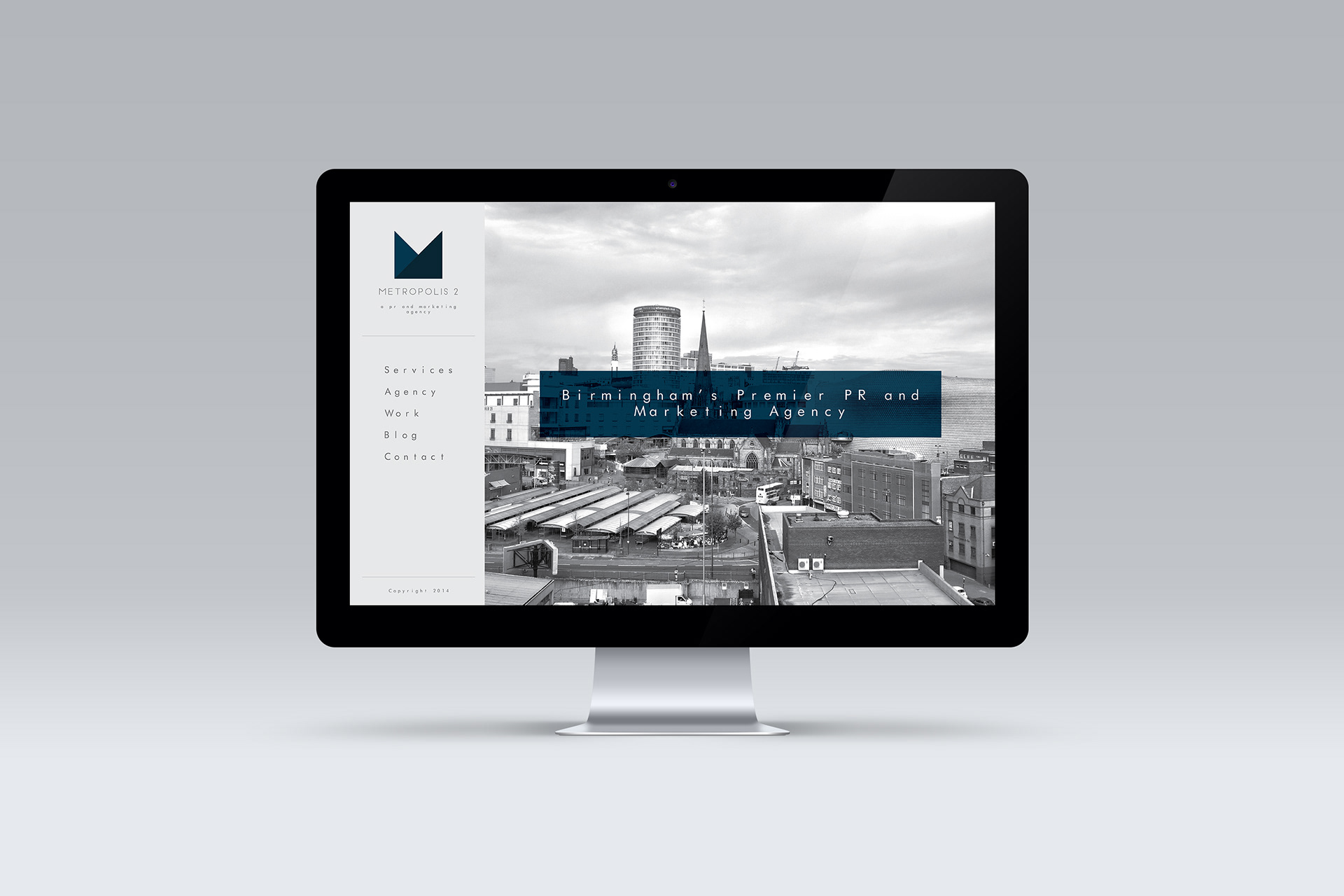
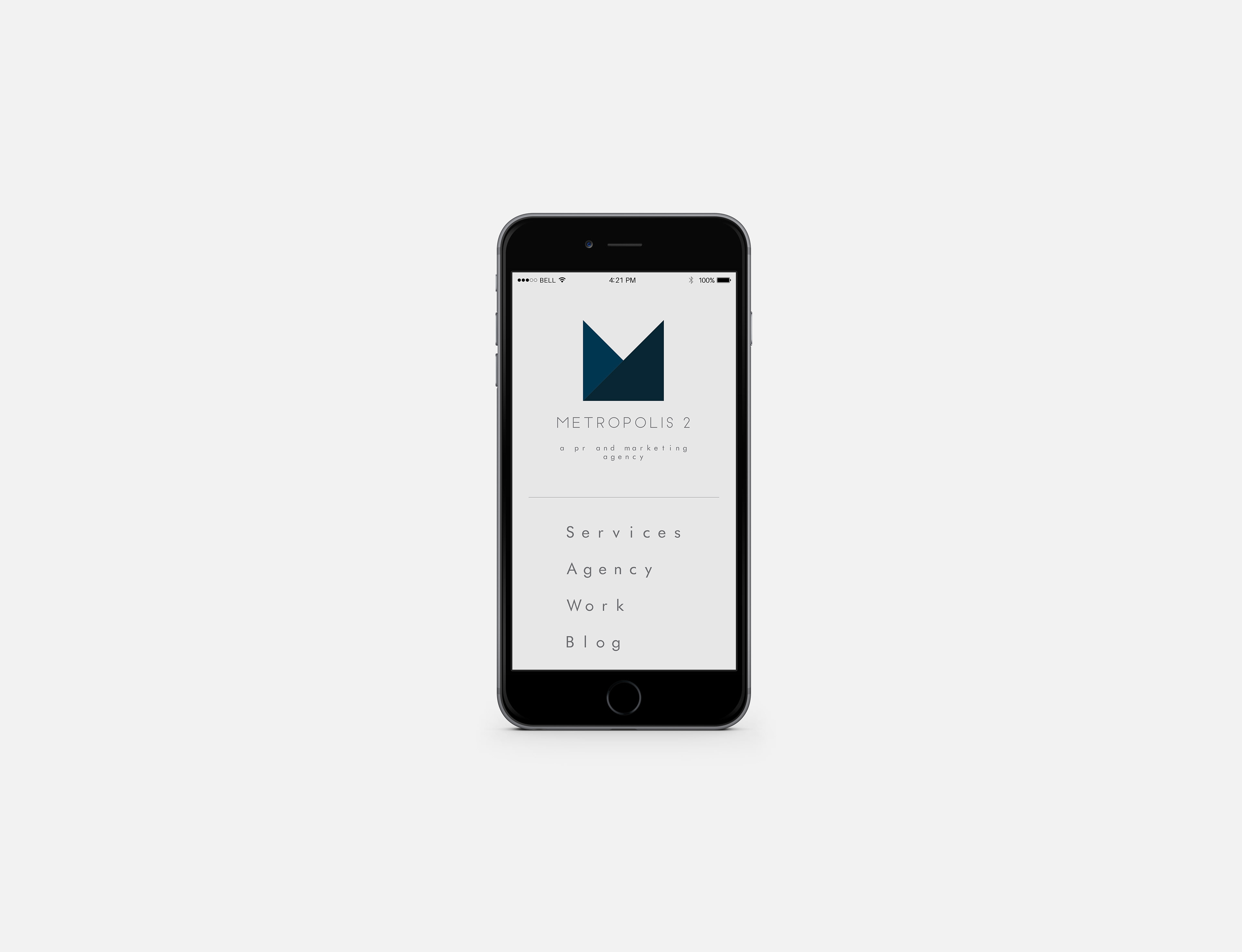
Rebrand for an existing PR and Marketing Agency based in Birmingham. The existing brand being over 15 years old, had an outdated logo which lacked dynamism and at a period of new growth and direction, the agency required a new visual format which would be carried into their stationery and Website. The logo itself was created to appear like a folded piece of coloured paper, the simplicity of its form creating an "M" from two shades of blue on a background of light grey. The colours used create a corporate and serious feel to the agency which reflects the nature of the clientele, which includes both construction and law firms. This logo can be used as a stand alone item or with the associated Wordmark. A contemporary bold clean sans serif typeface was used for the Wordmark, the typeface chosen reflects the name of the business, referencing to the names' origins. Uppercase characters are used to iterate the name of the agency and stand proud of the background.